Which brings me to another point, a mini-rant if you will. A close friend and I discussed this recently and we came to a great conclusion I thought. We (and by we I mean my friend and I) scrapbook to capture moments with our families. We want to showcase our gorgeous children, and the fun (and not so fun) moments and experiences we have with them. So when I scrap for myself, it is rare that I have fewer than three pictures on the page... I take a LOT of pictures.
So for me, it is hard to have that many photos, leave them large enough to see the detail, and leave a large amount of the always desirable white space.
I realize that digi-scrapping is an art form. I just think that too many of us are in love with our gorgeous digital elements, papers, and alphas; so the photos (the very reason for scrapping in the first place!), have begun to play second fiddle.
So to me, it is so important that the pictures be the star of the show. I like to take pictures and while I'd like to think I am not bad behind the camera. (Oh I want a real camera!) because I have the camera I do, my photos sometimes need an extra boost in the editing room.
I am a BIG fan of actions. I recommend visiting Pioneer Woman's blog (does anyone NOT read her blog?) and spending some time in the photos section. While you are hanging out there, make sure you download and install both sets of her actions. For the pictures on my last couple of layouts I have run both the Fresh & Colorful and Boost actions. These two actions alone will kick your pictures up a notch.
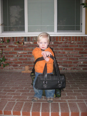
Here's an example, my before:
 My after:
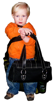
Isn't that a huge difference? One extraction later with a dash of Fresh & Colorful and boost. I also had to go into the Image Adjustments menu and fiddle with the brightness and contrast... all that kicking it up a notch washed out Alton's face.
Now, while actions can make all the difference in the world, they might not be the perfect fit for your photo.Don't be afraid to play with your levels, contrast, color, or balance if they are needed.
If you are not using Photoshop CSsomething or other, and ARE using Photoshop Elements, never fear. The Pioneer Woman has directions for photo editing in PS Elements.
So on your next layout, make sure you spend a few more minutes making sure your picture is as good as you want it to be! :)





2 comments:
Thanks for the tips and thoughts. Very insightful. I hadn't heard of the blog you mentioned, but plan on heading over there and taking a peak. Can't wait for her stuff for PSE to come out. Being so new at all of this, I look forward to any tips, hints, and help! Kudos!
I DO have a good camera, and the photos are always better when you play with them a little bit to hightlight the object of the photo. I don't think PW ever posts a photo that she hasn't played with in some form or other. I also love her actions, and through her photos section found another blog (MCP I think) that sells Actions (some but not all are Elements compatible). She has some really cool actions for the skin and eyes. Anyways, thanks for the freebie, and I agree, I have a hard time highlighting only one photo at a time, plus fitting in all the decorations I want to put on a page! It's hard sometimes!
Post a Comment